loader image

Skatepark Utrecht

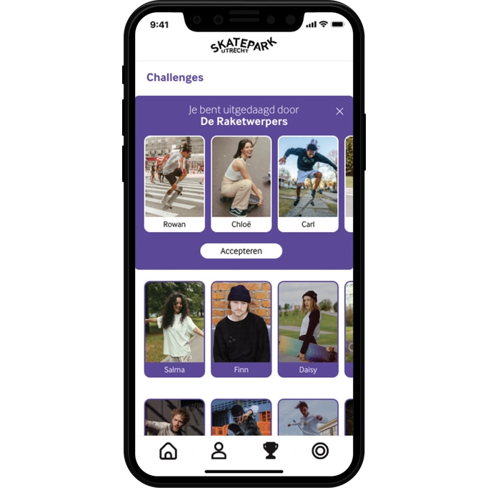
For Skatepark Utrecht I designed a complete app, including the logo and visual identity. The app serves as the platform for everything happening in the skatepark, from challenges and events to all team information.

The design reflects the energy of skate culture: colourful, bold and clear. I thoughtfully chose bright accents, strong typography and graphic elements that connect with the park’s atmosphere and the world of young skaters.

Skatepark Utrecht wanted to move away from unclear communication and needed a single recognisable platform for skaters and fans. My brief was to design an app that is both informative and visually strong, while keeping the raw energy of the skatepark.

I started by developing a logo and visual style. This formed the foundation for the app design: a blend of clear navigation and a distinctive look. Using bright colours, playful lines, graphic textures and typography that reflect a young, creative audience.

Throughout the design process I focused on usability for younger skaters as well as the appearance for sponsors and professional teams. The result is an app that takes skate culture seriously without losing sight of the fun.

Scroll to Top

Menu